


In a way, regardless of what the new branding would have looked like, there are many fans who would have hated it whatever it looked like, but I can’t help but feel that in the case of this logo, there’s good reasons not to like it. It feels more like a first attempt at a logo than a brand that encapsulates the heart of Bradford City, and by attempting to fit all of the items in that people wanted, it has lost sight of the most important part and that is the claret and amber, and the bantam. Get that right, and all else should follow from there.
That’s not to say there’s anything wrong with the bantam on the new badge, however we have nothing to compare it to, and that’s precisely where everything has fallen apart. The briefing and the choice of a designer rather than a branding expert to carry out something that Bradford City describe as “arguably one of the club’s biggest projects in the past 30 years” is the first mistake from where this project was doomed to failure.
Admittedly there are some who will cling to our current massively outdated badge as if it has been our badge since 1903. Others recognised that the badge was severely dated for the modern era, designed when people were just finding out that there was a thing called the internet, let alone ever thinking most of their lives would be spent using it. We needed a badge that would look as good on a smartphone thumbnail as it does on the side of Valley Parade.
So the choice by Ryan Sparks to go ahead with a rebrand is absolutely 100% correct and anyone who doesn’t agree, is wrong. It isn’t opinion, it is fact, and as someone who has experience in this field (although admittedly not qualified to be doing the branding for Bradford City), I can tell you what a nightmare our old logo is to work with on a daily basis. The current badge is nice, but in terms of being a brand has been quite embarrassing for a number of years now.
However, having given kudos to Ryan Sparks for recognising the need for a rebrand and making it happen, he has failed to do it the right way. The new design seems to be an attempt to appease the many City supporters that won’t like any change no matter how great it is. Those people will declare their love for the badge in 20 years from now when we are changing badges again, so it needed to be bold and brave, instead it was hung up on keeping it as close to the current badge as could be done and as a result failed miserably to appeal to anybody.
A rebrand is more than just a change of font and badge. The new badge only just scrapes by when it comes to solving the problems that existed with the current one because it isn’t focused on the key thing that every Bradford City would agree is Bradford City, the bantam! And this is where all of the focus needs to be and the rest should follow from that. Get the bantam right, and everything else will follow.
The Real Brief
I don’t know if Bradford City hired an actual brand strategy and design agency, but they would have had a better understanding of the brief they were given and used the correct people to do the correct jobs. Bradford City Football Club have proudly explained the brief that the logo designer will have been given. If they have, then I have no idea what has happened, have Bradford City been overly strict in their brief?
“the importance of our bantam, our distinctive shield shape and our unique Claret and Amber colours” and “important to keep the ‘BCAFC’ lettering in the identity, as this separates us from the likes of Bristol City and Birmingham City (BCFC)”. There was also a mention of the star that represents our 1911 F.A. Cup win.
If you insist on having the star and the shape of the shield there suddenly becomes a big argument (if you focus on the brand brief) why are the star and the BCAFC and the shape of the shield are more important than the stripes that have been dropped. I happen to agree that the badge, whatever it looks like, will work better without the stripes, they’ve done that right. But if you can ditch the stripes there’s a stronger argument that you can ditch the star and the shape of the shield. And this is the problem when you are giving a brief to a designer, because the designer is going to work within that brief rather than ask the make choices based on the very things that scream Bradford City and are most important to every Bradford City supporter.
Start At The Beginning – The Bantam
What is the Bradford City identity? Is it the shape of the crest? No, Is it the star? No. Is it the BCAFC? No. It is the claret and amber and the bantam. So from a branding point of view and a design point of view we know that the first and foremost things for the design are the claret and amber and the bantam!
Since the colours are vital, we can take this as read. This means all of the focus needs to be on the bantam. Every decision about what stays and what goes, and the shape of the shield will be based on bringing the most out of that bantam, it might not even need a shield.

Concentrate forces on the bantam
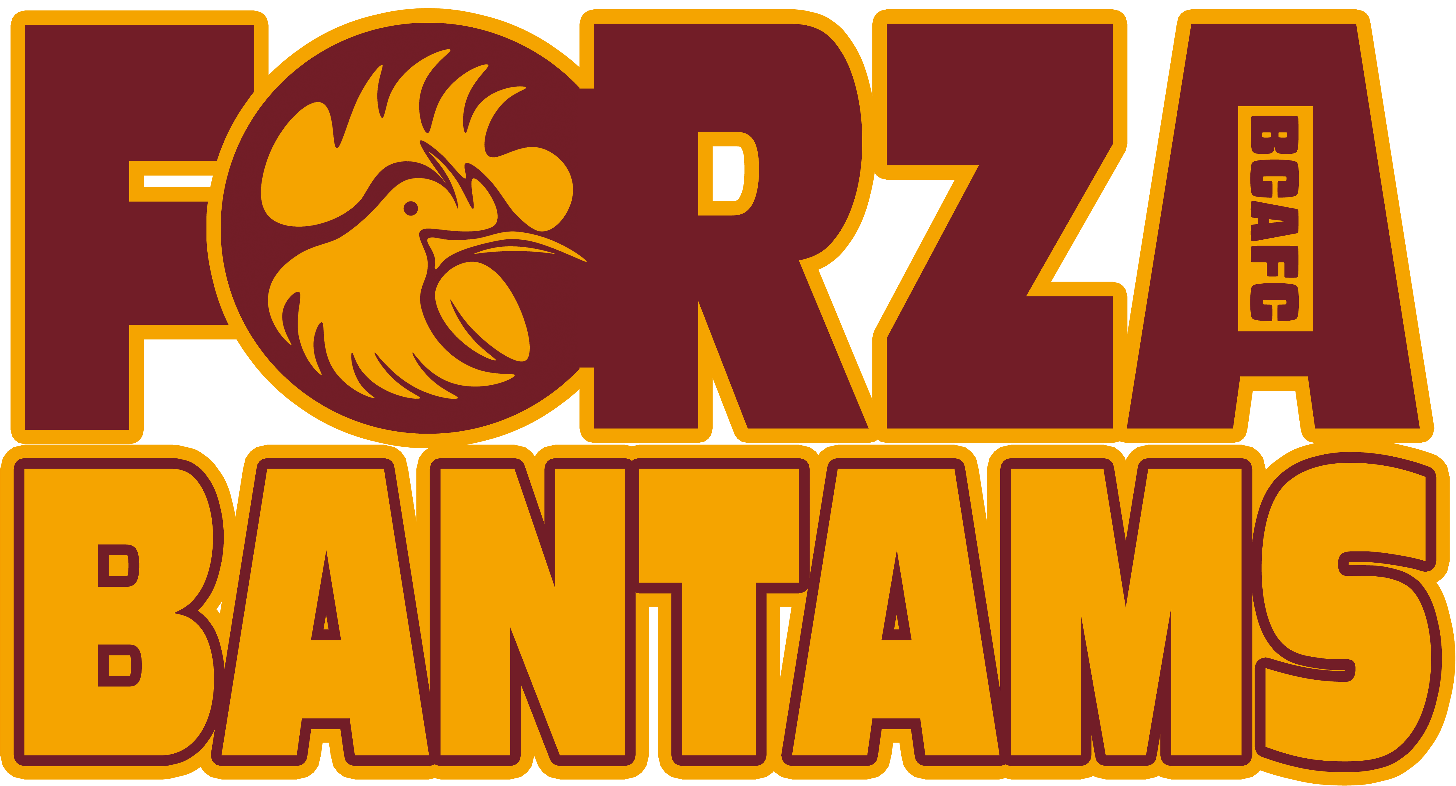
What is the problem with the bantam on this logo you may ask, and it is a fair question, there’s nothing wrong with it, but then you’ve nothing to compare it to. Why? All of that time was spent asking fans what they felt was most important to them in a badge, they totally neglected the one thing that mattered most. There should have been at least three different concepts of the bantam produced and then put to a focus group of Bradford City supporters, from there a final choice of bantam that would be the be all and end all of the badge design could have been refined into a final design.
If you look at the bantam we have on the badge, you’ll probably find the BCAFC text a bit odd and be trying to get your head around the position. But the fact is that the designer had two choices, either do something creative with the BCAFC in that big space or put the star there. This is due to the shape of the bantam and the shape of the shield clashing, the designer is forced into putting something there to fill that glaring space, that’s not how a slick brand happens. The bantams should be comfortable in the space, and if you need to ditch the star, or ditch the BCAFC, then so be it, because the bantam says everything and is loved by the fans anyway.
Could Have Both
But there’d probably be no need to ditch the BCAFC as it would fit snugly at the bottom or the top with a shield that is designed to fit the bantam. Put simply, the designer did the best they could given the circumstances, but it doesn’t work because it is forced. I’d have probably done exactly the same thing if I had to work with all of those restrictions. Maybe they were also restricted to a bantam that looked like the last one. Again, everything that is wrong with the badge you can trace back to the bantam, even thought there’s very little wrong with the bantams it’s self, it’s just a bantam rather than our bantam.
When doing anything creative, what you leave out is just as important as what you include. In general you can smell an amateur project because amateurs will leave everything they think is cool in whatever they do, where professionals leave most of what they do on the cutting room floor and are ruthless about what goes in. And to be fair, this design is professional, and he has done exactly that. However, again, you have to consider his job is to design based on that brief, not to say “you’re losing focus of the key elements of your brand if I include that”.

That Bloody Star
The biggest error of them all is the star. Having a nondescript star, that isn’t important to our identity, and was a fad that early 2000’s that is disappearing for a reason, defeats the whole object of the badge. To include the star where it is means the bantam has to be smaller, so does the BCAFC, so does the size of the shield. You are literally sacrificing all of those parts that the club stated was important to our identity for a star!
So what are we left with? We are left with a badge that does everything it says on the tin, it has the star, it is claret and amber, has the same shape shield as the current badge and says BCAFC on it. But in the effort to put together all of the things that were rated the most important, rather than sacrifice what needed to be sacrificed and focusing on the most important item above all else, the badge says has no heart whatsoever.
The problem is that you cannot please all of the people, and some will come to love the badge anyway, but not this one. This one is being put to the vote, and personally I would vote against having this crest. However, my concern is that by putting it to the vote every time, the majority will vote against any badge that is new and this is a massive concern. For this reason it is important to work on the design of the bantam and focus on getting feedback from the fans about the new design of bantam.
It is a job that needs to be done, so whether it is done in time for our 120th Anniversary or not is not the most important thing to take into consideration, if it isn’t resolved in time for the new season, so be it, but it needs resolving urgently and it needs changing. But it must be right, not a cop out of a design that appeases those who don’t want change but as a result ends up being nondescript like this one.
The club proudly stated it had “been consulting with supporters over the past 12 months about the club’s brand, and how they would like to see it re-imagined for the future”. It looks like there needs to be a longer period of consultation with more focus on getting support by impressing with a design that most of us will be able to get behind and take to our hearts, at least that way the club will be able to get the new badge approved in a vote.
Chief Executive Officer Ryan Sparks said: “This is arguably one of the club’s biggest projects in the past 30 years, so it was extremely important to make sure everyone had a chance to have their say, but also ensure the new identity is right for Bradford City AFC and can prove a strong part of the club’s image for years to come”.
This badge isn’t going to fly, but all is not lost, as far as branding goes this badge is heading in the right direction, but the mistake being made is thinking that this logo is the finished article. It is more of a prototype than anything else, now get this off to a branding agency complete with the brief and finish the job off properly!